You want to use the data which is provided by the Business Warehouse in your monthly report or any other report. The SAP Reporting tools like BEx Analyzer or Analysis for Office provides this data in "data tables". These are not easy to read and maybe it isn't possible to see at first glance what you want to express.
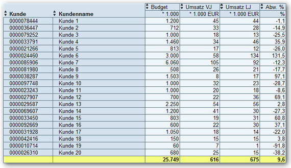
To make this a little presentable, you build your own reports with VLOOKUP or other Excel formulas. The result is usually like the following:
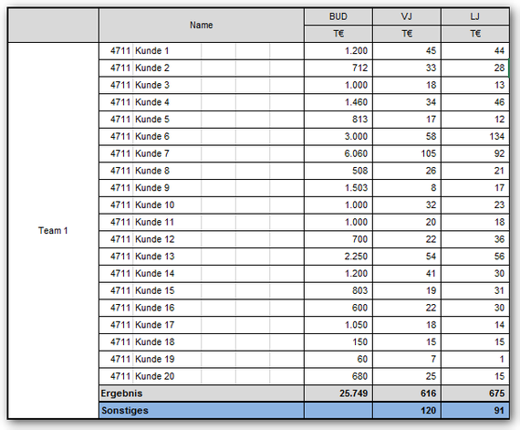
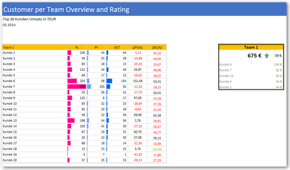
Now this often fits into the corporate identity (CI) of the company. But it is often difficult to understand and contains also a lot of redundant information. The following dashboard is inspired
by the HICHERT guidelines. This is still not perfect, but it shows what is possible.
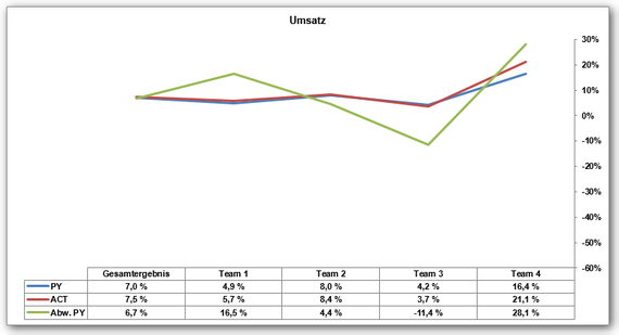
Here another example of a diagram what not really says a lot.
In contrast, you can see on the following picture immediately, as the sales of each product group for the current month developed. In the team view you can see an overview over your profit
margin.
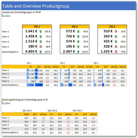
Such simple dashboards are quickly created in Excel, unfortunately hardly anyone takes time for it. These examples were created in Excel 2010. With Excel 2013 you have more opportunities to present data.
These posts might also be intersting:
author.
I am Tobias, I write this blog since 2014, you can find me on twitter and youtube. If you want you can leave me a paypal coffee donation. You can also contact me directly if you want.


Write a comment